
Twenty years doing what we love
When Fernanda Sodré and Alexandre Almeida founded Alef Design + Editora 20 years ago, one thing was clear: they did not want just beautiful projects. They wanted to create design that transforms.
And it did. Projects in healthcare, architecture, gastronomy, technology. Each one with its own soul, its unique universe. Feedback always came with the same phrase: "You understood the essence of our business".
It is not magic. It is listening. It is diving deep into what each brand represents and translating that into something visual, memorable and, above all, authentic.
That is how it was with Hospital São Paolo. That is how it was with Dedicatto. And that is how it is in every project we embrace.
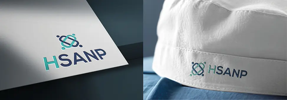
When design transforms an entire hospital
Hospital São Paolo came to us with a challenge that went far beyond a new logo. They wanted a complete transformation — and that was exactly what they needed.
We started with the visual identity. But we quickly realized that redesigning the brand was not enough. We had to make every floor, every corridor, every space of the hospital breathe the new essence we were building.
We dove into the world of healthcare with a question: how do you make a hospital environment convey warmth without losing its seriousness? How do you balance cutting-edge technology with human warmth?
The answer came in layers. A new visual identity that communicated trust and care. A color palette designed not just to look beautiful, but to reassure. Signage that guided without confusing. Visual elements applied floor by floor, transforming the experience of everyone who walks into that space.
The result? A hospital that does not just look different. That feels different.
Patients and companions comment on the environment. The medical team feels prouder of where they work. And most importantly: the brand now reflects the excellence of the service that was always there, but that the world could not see clearly.
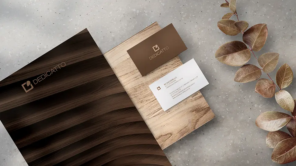
Positioning changes everything
Dedicatto had an excellent product. But something was not connecting. The market did not see the real value of what they offered. It was a positioning problem — and positioning is built, above all, visually.
We did not just touch the logo. We rethought how this brand presented itself to the world. What story it told. What emotions it stirred. How it stood out in a saturated market.
The work was a complete repositioning. A new visual identity that communicated sophistication without losing accessibility. A visual language that spoke directly to the right audience, in the right way.
The impact was immediate. The brand gained presence. People started to understand what Dedicatto represented. And understanding is the first step to valuing — and to choosing.
That is the power of strategic design. It is not about making things "pretty". It is about making every visual element work in favor of the experience, the perception, the emotional connection.
The silent revolution of branding
We are living a fascinating moment in the universe of brands. The data confirms what our intuition already knew: 76% of people prefer brands that create real connections. But what does that mean in practice?
It means that the most valuable brands in the world do not sell products. They sell meaning.
Think about it: can you picture the Apple symbol without feeling something? A Nike swoosh without thinking of overcoming? The golden M of McDonald's without smiling at childhood memories?
And here is the secret: none of these brands would need to say a word for you to recognize them. A symbol. A color. A typography. And done: you know exactly who you are talking to.
This is no accident. It is visual strategy elevated to the level of the soul.
What we learned in 20 years
After two decades working with brands of all sizes and sectors, certain patterns became clear:
Companies with consistent visual identity are 23% more likely to be remembered. But consistency does not mean repetition. It means having a visual voice that people recognize and trust.
85% of purchase decisions are influenced by the brand's appearance. And "appearance" here is not surface. It is clarity. It is the feeling that "this brand knows who it is".
Brands that invest in strategic visual identity grow up to 30% in engagement. Because engagement does not come from shouting louder. It comes from making sense.
Each universe, a new conversation
Here is what we discovered moving between healthcare, architecture, gastronomy, technology and so many other worlds: there is no ready-made formula.
What works for a clinic — where every visual detail must convey trust and warmth — does not work for an architecture firm, where creative boldness must leap to the eye.
A startup demands disruption. A restaurant demands sensorial experience. A consultancy demands solidity. Each sector has its own language, its unwritten codes, its unconscious expectations.
And it is precisely because we know how to read these universes that we manage to deliver what clients call "differentiated design". It is not genius. It is sensitivity trained over hundreds of projects.
It is knowing how to ask the right questions. It is diving into the unknown and emerging with something that specific market recognizes as authentic.
The secret hidden in a simple question
Simon Sinek revolutionized the business world with a seemingly simple idea in the book "Start With Why": people do not buy what you do, they buy why you do it.
Think about it for a moment.
Two companies sell coffee. Both have quality beans, fair prices, good service. But one of them makes you feel that, by buying that coffee, you are supporting family farmers, preserving ancestral traditions and taking part in a conscious value chain.
Which one do you choose?
The answer is obvious. And this is exactly where visual identity steps in as the protagonist.
Because your logo, your colors, your typography do not exist to say what you sell. They exist to communicate why you exist. To translate purpose into visual language. To make people feel your reason for being before they even read a word.
When we work with brands, the first thing we do is dig up that "why". Not the one written on the mission statement framed on the wall. But the real, visceral one — the one that made you get out of bed and say "I am going to build this company".
Because it is this why that will turn into every visual element. It is what will dictate whether your palette will be bold or sober. Whether your typography will shout or whisper. Whether your shapes will be disruptive or welcoming.
Visual identity without purpose is decoration. Visual identity with purpose is connection.
Identity before image
When we start a project today, we no longer ask "what colors do you like?" or "what style do you prefer?".
We ask: "If your brand were a person, who would they be? How would they speak? What would they stand for? Who would they walk with?"
Sounds too philosophical? Maybe. But it is exactly this depth that separates a visual identity that works from a logo forgotten in a folder on the computer.
Because in the end, people do not buy from companies. They buy from other people. And your visual identity is the first handshake, the first eye contact, the first impression your brand makes.
From product to community: the future is already here
The market has changed. Radically.
Today, 64% of consumers are more loyal to brands that offer experiences, not just products. And brands that build communities grow twice as fast as their competitors.
Look around. The brands that grow the most are not the ones that sell better. They are the ones that gather better.
These brands use visual identity not as decoration, but as a language of belonging. A language that unites, identifies, says "you belong here" without needing to shout.
What does this mean for your company?
If you are reading this, you have probably felt it. That feeling that your brand is not communicating everything you would like. That there is a mismatch between who you are and how the world sees you.
It is about translating essence into image. It is about making someone who has never heard of you feel, in three seconds, exactly what you want them to feel.
And this takes depth. It takes listening. It takes someone who knows how to ask the right questions and turn the answers into something tangible, visual, memorable.
The investment that pays back in trust
There is a myth in the business world: "visual identity is for when the company is already big".
The truth is the opposite.
Visual identity is what makes the company grow. It is what turns potential into presence. It is what makes that client, facing ten options, choose you.
A poorly crafted design is not just ugly. It is expensive. It costs in credibility. It costs in lost opportunities. It costs in clients who never arrived because they could not find you in the noise.
On the other hand, a well-built visual identity is like having the best storefront on the street. People stop. Look. Walk in. And come back.
More than visual: a matter of identity
At the end of that phone call I mentioned at the beginning, the client said one more thing:
"Now, when I introduce my company, I am no longer selling. I am telling who we are. And people want to be part of that story."
That is it. That is exactly it.
Visual identity is not about having a beautiful logo to print on a business card. It is about having clarity about who you are, so when you speak, your brand speaks with you. In unison. With strength. With truth.
It is about turning values into colors, purpose into shapes, essence into visual experience.
It is about making your brand not just be seen, but be felt.
The start of the conversation
This article does not end with an aggressive call to action. It will not end saying "contact us now".
It ends with an invitation to reflect:
When someone sees your brand, what do they feel?
If the answer does not come immediately, if there is hesitation, if you are not sure...
Maybe it is time for a conversation. Not about pixels and pantones. But about who you are, what you believe in, and how to make the world see that too.
Because well-crafted visual identity does not shout. It whispers. And yet, everyone listens.
Alef Design Editora
Revealing essences, building brands